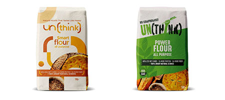
Colour choice is key to standing out and enhancing the believability of the proposition (i.e. drawing on latent / subconscious associations consumers may have)
THE COLOURS ARE COMPLIMENTING AND ADDING VALUE TO CONCEPT
- Earthy colours generally communicate ‘natural’
- White - stands out but represents ‘bleached’
- Green – natural and fresh
- Purple – unexpected and differentiating but is alien to the category
- Teal – differentiating, a contemporary take on natural
- Blue - trustworthy