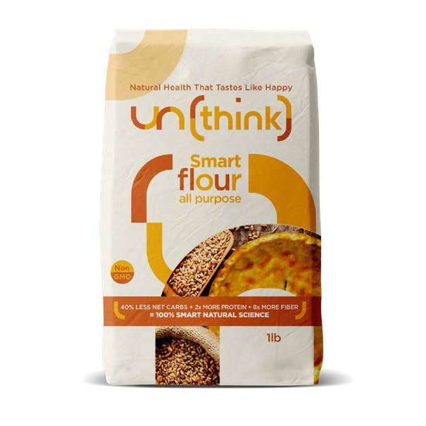
A big sunshine of health in a bag
Brand Dominace
The combination of the brand marque and wording promises healthy delicious food.
Tapping into Lifestyle Choices
The words LIVE WELL Instantly deliver a differentiator and is easy to relate to and understand. Live Well makes me feel good Emotionally a FEEL GOOD FACTOR: There’s a strong relatability with the claim “Natural health that tastes like happy’ as well as ‘Live well’
Information Heirachy
The literal product benefits are better communicated as an integral part of the information hierachy as opposed to being presented as a graphic violator. Although respondents noticed this messaging, readability was disconnected from the product title which felt counter intuitive .
Visual Appeal
visually appealing, natural colour tones communicates healthy and natural. Organic is mentioned but not visible. The representation of grain and baked bread imply organic. The image is motivational and inspires baking, specifically bread. What is shown in this area and it’s context has an influence. In this context the image of bread and grain also deliver perception of taste along with the words “ taste like happy”
Characteristics
The product is seen as ALL NATURAL with this message having a dominant influence. The inclusion of the 100% draws attention, making people question whether or not other brands are 100% natural and therefore this is the one to choose. The repetition of the word ‘natural’ (stated twice on pack) reinforces the message. The uniqueness of the product was noticed and commented on specifically with reference to the 40% Less NET Carbs / 2x More Protein and 8x More Fiber. “extremely rare in a product”
