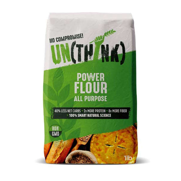
This proposition represents a positive revolution in flour and a compelling reason to choose - a better-tasting, healthier product which cuts out the genetically modified ingredients we don’t need (even appearing to be healthier than other competitor flours who claim lots of nutritional benefits).
The simplicity of the design with the health and product benefits simply and clearly communicated (the fact this flour is Non GMO, natural, sustainable and less refined for instance), is very appealing and feels as if it will make the purchase decision easier when comparing with other flours.
It is perceived as high quality, ‘fresh’, ‘fun’ and ‘free’ whilst at the same time being earnest and effective. The green colour coding and the fist portray a sense of health, community and power - hand-made vs mass-produced and putting people at the heart of the ‘process’.
The integration of the benefit communication as an integral part of the design (as opposed to a violator) combined with emotive, believable photographic imagery which is relatable and natural builds trust in the proposition.
The Tone of Voice (POWER FLOUR) is engaging and enhances the appeal to a ‘woke’ audience as it’s perceived as good for the community AND the planet by “giving something back.”