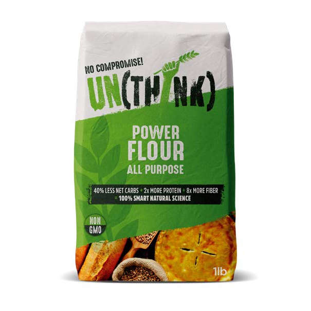
This design engenders a strong emotional connection with respondents - “Just seeing the design alone, you are already in love with the brand and the brand green colour blend is just perfect.”
- Its combination of ‘fresh green’ colour, bold logo, impactful large white text in a centred layout and simplicity of information communicated via the banner device means it is perceived as “completely different’ and memorable and a “modern twist on flour.”
- It is perceived as healthy, premium, fun and more urban and hip than other brands.
- It’s a simple, progressive, informative design which means the shopper doesn’t have to spend time “flipping it over to read the little bitty print on the back.” “Non-GMO too? Wow. I’m going to buy it now.”
- Respondents trust and believe in the brand proposition. There is
a perception that the brand is “thinking outside the box” to deliver something different than all other products in market.